
Inventory Analysis Examples
Manufacturing and Warehousing
Fluid Products Corporation
The client in this project was an old firm with a long history. They built large, highly specialized pumps and certain critical fittings and controls to match those pumps. The objective of the project was a new plant layout that emphasized Cellular Manufacturing. Of necessity, material storage played a large role in this layout project.
Historical Analysis
- A long-term historical analysis, figure 1, brought forth two major conclusions:
- There was a downward trend in turnover that had persisted for at least eleven years and probably much longer.
- At the beginning of this period, turnover was near the lower bounds of industry averages but by the time of the study had fallen significantly below those averages.
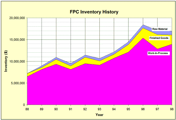
- From figure 20 it was evident that inventory was increasing faster than sales.

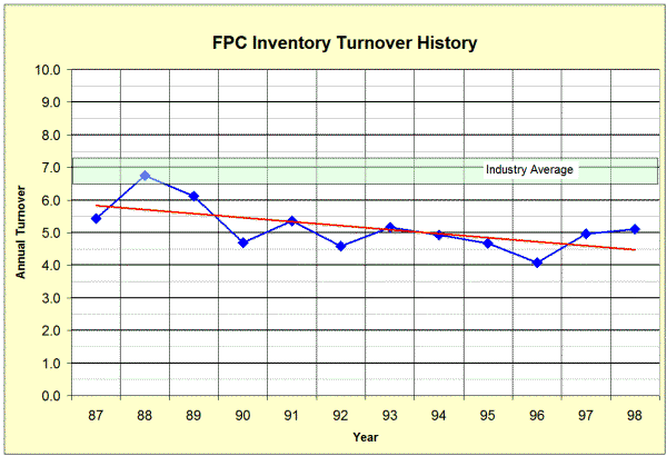
Figure 1 FPCl Long-Term Historical Analysis
2 Typical Long-Term Historical Analysis
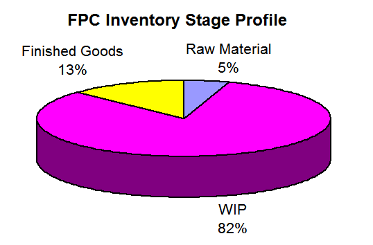
Figure 3 Inventory Stage Profile
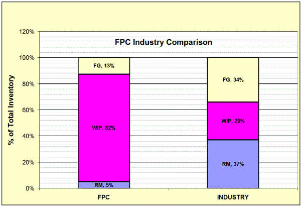
Fig 4 Industry Average Comparison
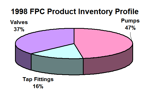
Fig 5 Industry Average Comparison
Where Was This Inventory?
The next reasonable question was “where is this inventory going?” Figure 2 and figure 3 provide the answer. Figure 3 shows that 82% of the current inventory is in WIP. Figure 2 shows that the growth of inventory has been almost entirely in WIP.
Figure 4 shows how the relative proportions of FPC’s production stage inventory compares with industry averages. Since there were few industry groups that fitted FPC’s products exactly, the proportions shown in figure 4 are approximate. This approximation makes little difference, as it is clear that FPC’s WIP is significantly out of line.
Three distinct product lines existed. Figure 5 shows the inventory associated with each product line. The Valve product and Pumps represented the majority of the inventory. However, valves were a highly seasonal product and much of that inventory was in Finished Goods. We might have displayed the data differently, for example, calculating turnover by product line.
It seemed clear to everyone at this point that pump WIP was the primary culprit and that the amount of this inventory was extremely high.
The Root Causes
When the proportion of WIP is too large, it indicates problems on the shop floor or the scheduling and support systems for the shop. Material flow diagrams and process charts verified the casual, visual observation that confusion reigned on the shop floor and material movement was excessive, confused and erratic. This, in turn, necessitated complex scheduling and other elements that amplified the negative effects.
Note::
This example comes from a Strategos consulting project. We have changed names and specifics to disguise the client's identity. The essentials, however, come directly from the project.
How did this situation develop? The root causes of this problem were in the firm’s Manufacturing Strategy or rather their lack of Manufacturing Strategy. Decades prior to this project, the company operated with functional machining departments. Equipment was simple and small-scale but required highly skilled machinists.
As the firm grew, each functional department became more specialized, more inward-looking and more disconnected from the others. Then, Numerical Control machining was introduced. These machines were expensive and required high utilization to show profitability. Schedules were arranged to load the new NC machines, scheduling became more complex and queues grew to ensure that the NC machines always ran. WIP increased accordingly.
The solution was a Manufacturing Strategy that emphasized Cellular Manufacturing. Most workcells were designed around one of the new NC machines which became the "key machine" for that cell. Many other aspects of Lean such as teams and Kanban were also used.
Midwest Machinery Parts
The firm marketed and distributed replacement parts for a particular type of industrial equipment. They imported the majority of these SKUs from China. Most SKU’s came as finished product, ready for sale. Some arrived as semi-finished product that was completed in MMP’s own shop according to customer specifications. We will emphasize primarily those aspects of the project involving the inventory analysis and what it reveals.
Figure 6 shows MMPs overall inventory turnover for the previous four years. Earlier history was unavailable. Turnover based on COG and COGS was 3.1 in 2007. It dropped to 2.0 in 2009, rose to 3.0 in 2010. However, recent additions to inventory indicated another drop in turnover was imminent. This turnover is way below average for the industry. In fact, very few distributors in any industry have a turnover less than 2.5. Moreover, MMP’s turnover appears to be worsening.
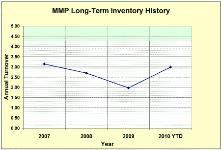
Figure 6 MMP Long-Term Turnover
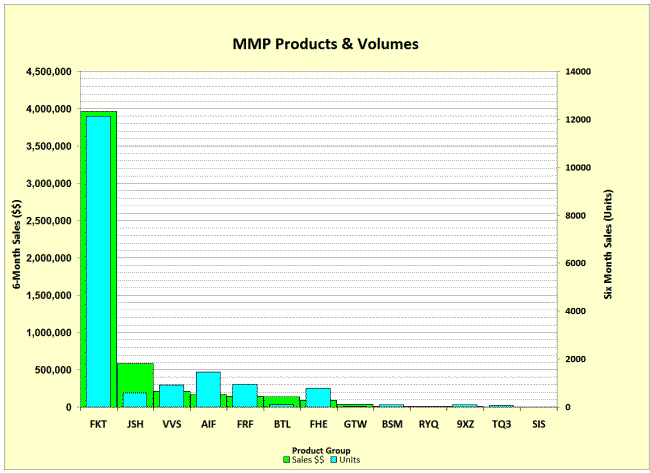
Figure 7 Product-Volume Analysis
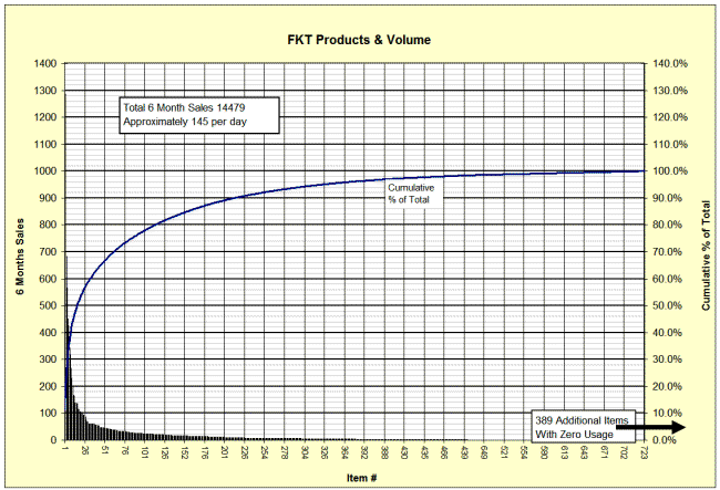
Figure 8 Product-Volume FKT Only
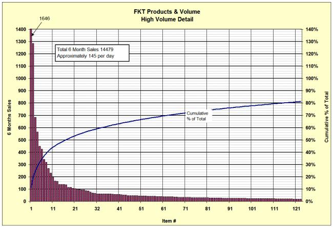
Figure 9 Product-Volume Detail FKT
Product-Volume Analysis
Figure 7 shows MMP’s product lines and volumes for the previous 6-months. The green bars represent dollar volume at COG. The blue bars represent unit volume. The chart shows that the FKT product group represents 74% of total sales volume and a similar portion of unit volume. Casual observation indicated that the vast majority of inventory was the FKT product. For this reason, we decided to focus the remainder of the study on FKT products. Most of the data, charts and tables that follow figure 7 include only those FKT products.
Figure 8 is the P-V chart for the 1112 FKT parts. About 100 items account for 75% of FKT sales volume. The remaining 1000 or so items represent only 26% of sales. Figure 9 examines the highest volume 100 items to reveal more detail. Here we see that only about 10 part numbers account for 42% of all FKT sales.
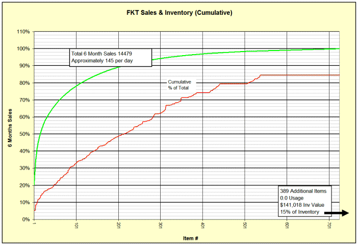
Figure 9 FKT Sales & Inventory Cumulative
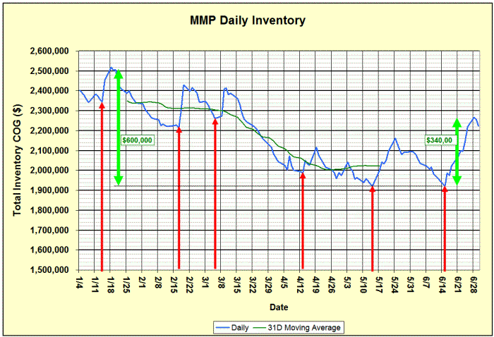
Figure 10 Short Term History-All Items
Usage of Inventory Funds
Figure 9 is similar to figure 8. Individual part numbers are on the X-axis and are ranked, left to right, by sales volume. The actual part number is not shown due to space constraints on the diagram. The upper curve (green) shows the cumulative percentage of total sales for each part number. The lower (red) line shows corresponding cumulative inventory for those part numbers.
In an ideal situation, inventory level for a part would reflect the sales for that part, the inventory turns would be identical for all parts and the two graphs would coincide. In practice, slower moving parts usually have higher variability, more inventory is required to compensate for the variability and turns are lower. The cumulative inventory curve would fall slightly below the cumulative sales curve in the left portion of the graph but would gradually rise to meet it.
The continued gap on the right of this graph is the result of dead inventory. It represents about $141,000 of inventory with zero sales during the six-month study period. The gap at the left of this graph indicates that too much inventory is dedicated to slow moving items and probably insufficient inventory to fast moving items.
Short-Term History
A short-term history was compiled from a spreadsheet maintained by the Accountants. It reflected total daily inventory as entered into the inventory control system from January through June. The blue line in figure 10 shows this daily value while the narrow green line is a 31-day moving average. The patterns provoked several important questions:
• What was creating the steady decline from January through mid-April?
• What created the sudden, periodic, short-term increases?
The sudden, periodic increases resulted from the arrival of shipments from China. Orders were placed one per month (maybe) and consisted of 20-25 containers. These were all scheduled to arrive simultaneously. The red arrows indicate arrival dates.
The decline in inventory originated with a management edict to reduce inventory in the face of falling sales. After 2-3 months, shortages developed and purchasing increased orders. However, it required 60 days or more to build and ship the replenishment material. When these larger orders started arriving in May, inventory increased again.
It would require as much as two weeks to unload and receive such a large number of containers and this is why the increases are not instantaneous. When a shipment arrived, most other operations were shut down and there was a lot of commotion and confusion during receiving. After receiving, it might take several more weeks to put the material in its proper position and this created even more confusion.
Sales Orders
We analyzed the sales orders during this six-month period to profile the size and types of orders. The results, on average are:
|
• 36.4 Orders per Day • 3.4 FKT Items per Order |
• 1.5 Line Items per Order • $1134 per Order |
The overall conclusion is that MMP’s’s orders typically consist of mostly small orders, probably going to the replacement market. On rare occasions, large orders appear these large orders go to contractors for major distribution center projects or to Original Equipment Manufacturers for their production needs.
Obsolete Parts
Of the 5870 part numbers, 2770 or 47% show no usage activity during the six-month period of the study. There are several possible reasons for zero usage:
• Part # may be obsolete and superseded by a different part#.
• There were no orders.
• The part was out of stock, unavailable for sales and the sales were lost—hence no usage.
Stockouts & Slow Movers
Figure 11 displays the results of an aging study of the FKT inventory. This study includes any part numbers that a) have usage during the six-month period or b) have on-hand inventory. We considered that any item with more than 6-months of inventory was overstocked and any item with 0.1 month or less as a stockout.
With the present supply chain, an OH level of 1-6 months might be considered a “normal” or target inventory level. Improvements to the supply chain and reordering system will reduce this significantly and target levels of 1-3 months should be attainable.
Figure 12 shows an astounding 67% stockout rate. If these stockouts include high-volume, popular items it indicates a very large loss of sales. If stockouts are concentrated in slow-moving items, it may not be as serious.
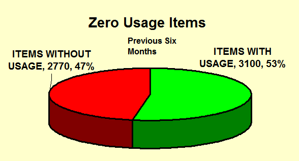
Figure 11 Obsolete Parts
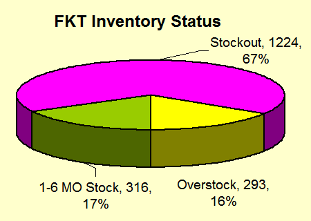
Figure Fig 12 MMP Stock Status
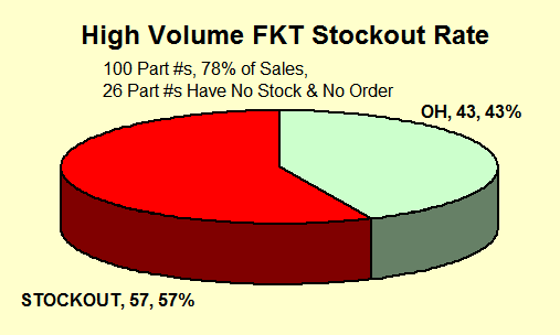
Figure 13 Stockouts on High-Volume Items
To check on this, we segregated the highest-volume 100 parts and looked at the stockout rate separately. The stockout rate on items that make up 74% of sales was 57%, figure 13. The 1000 lowest volume parts had a stockout rate of only 22%, figure 14. Clearly, there was something very dysfunctional in the purchasing and replenishment system.
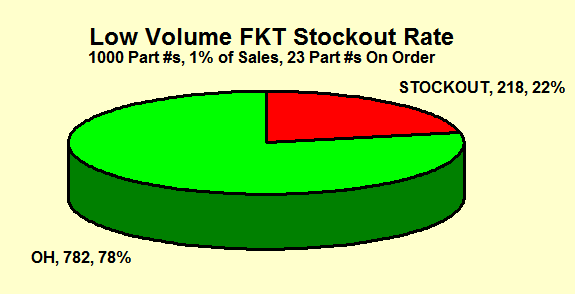
Figure 14 Low-Volume Stockouts
Figure 15 Sales & Inventory History—
Part# 1254-44
Short-Term Historical Analysis
Item #1254-44 was MMP’s sixth largest selling item with an annual volume of $99,792. It was typical of the high volume parts. We constructed a short-term history using the current On-Hand and a transaction history report. The objective was to identify patterns in sales and replenishment that might give insight into the algorithms used for re-ordering and replenishment. Figure 15 shows this chart.
On 1/1 the inventory was 420 pieces or about a five month supply at the average sales rate of 2.6 per day. No significant replenishments were arrived until 5/21. It may be that the management decision to reduce overall inventory in the face of falling sales at the start of the year was partly responsible for this non-replenishment.
On 4/6, the Midwest DC was out of stock. Since this DC accounted for 76% of total sales, total stock at all DCs remained constant because very little was sold from the East and West coast DCs. However, this eliminated any further sales from the Midwest DC. It appears that no replenishment orders were placed until the Midwest DC’s stockout or, at least, until the stock level was very low. Since it takes about 60 days to build and ship the product, new product did not start arriving until 5/21.
The replenishment orders that started arriving on 5/21 were very large. Inventory increased rapidly as these orders arrived until the end of the study on 9/12. At this time, there were more than 500 units in stock and even more units in transit and due to arrive shortly. All this on an item that sold, on average, 2.6 per day.
Accomplishments of The MMP Inventory Analysis
The inventory analysis was not the entire story for this project. Additional work was necessary to identify root causes and develop solutions and recommendations. The inventory analysis did accomplish the following:
- Established that overall inventory was 2-3 times larger than normal.
- With all of this excess inventory, customer service was poor and significant sales were lost.
- Inventory was concentrated on the wrong items.
- Inventory levels for individual items were erratic and varied greatly.
- Replenishment policy and practice was dysfunctional.
- Much additional information and many insights developed indirectly from the gathering of data and discussions.

■ ■ ■ ■ ■ ■ ■

|
The Strategos Guide To Value Stream and Process Mapping goes beyond symbols and arrows. In over 163 pages it tells the reader how to do it and what to do with it. |
The free newsletter of Lean strategy