How To Chart (Map) Your Process
A Step-By-Step Tutorial
Process Mapping is also known as Process Charting or Flow Charting. It is one of the oldest, simplest and most valuable techniques for streamlining work. It is also subtle and requires experienced facilitators for best results. A process map visually depicts the sequence of events to build a product or produce an outcome. It may include additional information such as cycle time, inventory, and equipment information.
Some of the benefits of Process Charting (Mapping) are:
- Spotlights on waste
- Streamlines work processes
- Defines and standardizes
- Promotes deep understanding
- Builds consensus
Several systems of conventions exist. At Strategos, we find that the original system invented by Frank Gilbreth in the early 1900's is still the most useful. The Gilbreth approach is highly visual and discriminates between waste and value-added activity. It is also simple, intuitive and easily used by untrained groups. An experienced facilitator, however, is required.
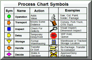
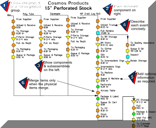
The figure below shows a Process Map example and instructions for its construction. In most situations only the circle symbol (Operation) adds value.
- Follow one product or a narrow product group.
- Place the dominant component on the right.
- Show other components and subassemblies on the left.
- Describe each event concisely.
- Add additional information as required.
- Merge items on the chart only when the physical items are merged.
General Hints
Identify The Product
Process maps and charts show the sequence of events that act on a product. Therefore, we must carefully identify the product and ask "What is being done to the product."
In manufacturing processes, the product is physical and easily identified. For service and office processes it is easy to confuse activity with the product.
Information Flows
A common criticism of Process Mapping is that it does not represent information flows. Many Process Maps do not show information flows, but they can show them and often should. To map information, consider it as packet such as a work order or a database record. Or, a component necessary to complete the event. Chart information sequence with dashed lines.
The Team
When mapping the current state, assemble a broad based team from all areas and several levels. It should include workers because they know the details of what really happens. It should include engineers and support people because they have a broad view of the process and know what is supposed to happen.
Drawing the Working Map
During a mapping session the entire team should see the entire map. And, each individual be able to focus on any detail that sparks a thought.
Draw the map on large paper sheets. This may cover several walls in an average conference room. Later the map can be redrawn with computer tools for distribution.
Using Symbols
Rules of Thumb
These rules of thumb apply to a factory-level maps. You may want to modify them for more detailed maps.
Storage & Delay--
- When a product is in an official storage location with a record, use the Storage symbol.
- If the product is set aside casually to wait for a fork truck, for example, use the Delay symbol.
- Set a time, say five minutes, below which a Delay will not be shown.
 Handling & Transport
- If the product moves more than three paces, use the Transport symbol.
- If the product is sorted, rearranged or moved less than three paces, use the Handling Symbol.
- If a transport delay is more than five minutes for a macro-level map, show the delay. Otherwise consider it as part of an adjacent event. Use a 30-second limit for micro-level maps.
When In Doubt...
- Combine Symbols.
- Add a question mark to signify the uncertainty.
Value Added
Occasionally, it is unclear whether an event adds value. Here are three useful tests:
- Does the event physically transform the product in some way? If so, it probably adds value.
- If the customer observed the event, would he balk at paying its cost? If so, the event probably does not add value.
- If the event were eliminated, would the customer know the difference? If not, the event is probably non value added.
Controversy
The following process events often bring controversy:
Inspection--

- Inspection refers to an examination of the product to determine if work has been done correctly. It does not refer to statistical process control activities that lie outside the chart.
- Inspection rarely adds value because it does not change the product.
- When the customer perceives inspection as value adding, requires it and pays for it, you may want to consider it a value adding event.
Curing/Drying--
- These change the physical properties of the product and should use the "Operation" symbol rather than a "Delay" symbol.
Transport--
- Transport and Handling rarely add value inside a factory.
- The customer may perceive a "value of place" and is willing to pay for it. Transport is then an added value.
Setups and Batches
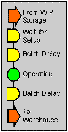
Batch processes and setups frequently confuse mapping teams. When this happens, return to the question "What is happening to the product?"
Setups
- During a setup, nothing happens to the product. The product simply waits for completion of the setup.
- The setup is a separate process and can be studied as such. It has nothing to do with product other than causing a delay and does not show on the process chart.
- This map detail shows a typical batch operation with setup.
Batching
- Processing in batches introduces a delay before and after an operation while the remainder of the batch is processed.
- Batching for transport can be as problematic as batching for processing. Moves often have delays when they wait for material handlers.
Detail Levels
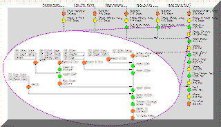
Process maps can depict many levels of detail. Like a Mandelbrot set, every event can expand to reveal more and more detail, as shown in the figure. Determining an appropriate level for the map is vital. With too much detail, the map becomes too large to see or print; too little and important elements are lost.
The best level depends on your purpose. Here are some guidelines:
Workflow & Group Technology-- The objectives here are to simplify movement between departments or develop part families. Operation events normally correspond to operations in the process specification or routings. Often, each operation is in a separate department. When charting at this level, be sure to include all moves, set downs and delays between departments as well as any moves from a departmental staging area to the process equipment.
Workcell Design may require a finer breakdown of the events. Once the product families and cells are selected, only those events within the cell or immediately subsequent and prior need be depicted.
Workstation Design-- At this level, events are quite detailed. In most situations, a process map is not the best way to analyze workstations, although variations such as right-left hand charts are often useful.
Most beginners make their first charts with too little detail and often overlook non-value added events.
In theory, process mapping could be extended to sub-micro maps that show micro-motions. Or, It could extend to global value-chain processes. But, usually, other tools are more suitable for these situations.
The maps below show two levels of detail. The upper map shows individual elements within a workcell such as Head Subassembly and Body-Coil Subassembly. It also shows the moves and delays between these elements within the cell.
The lower map explodes the Head Subassembly operation into smaller elements. Even this map could conceivably be exploded into micro-motions, but there is not much point in doing so.
At an even higher level than shown below, all assembly operations would compress into the single element, "Assemble Pump." Such a map would work well in sorting out product families.
The first map, below, would be appropriate for workcell design while the second map would help workstation design.
Setting Boundaries
Process maps are most useful at a micro or macro level. Micro level charts show small steps such as "Assemble Cover" and "Adjust Tension." Their boundaries are usually the physical boundaries of a workcell or department.
Macro-level maps show the process on a larger scale and often have boundaries corresponding to the boundaries of the factory. Macro-level maps consolidate small process events into a single larger event such as "Assemble Product."
A road map of Missouri also shows parts of Iowa, Kansas, Illinois and Arkansas. Apply this idea to your process map also. Start a bit upstream from the perceived area of interest and move downstream a bit beyond your area of interest.
For example, if you are concerned with the entire factory, start at the supplier's dock or inbound truck. Include the customer or the outbound truck.
If the project is a workcell design, start with the upstream workcenter or area. In this way, you capture moves in and out. You may discover that factors outside your perceived area of interest have major effects.
Example of Information Charting
The example below shows an assembly process for commercial dishwashers. Notice how the subassemblies stand out. This particular map was very useful in laying out the assembly area. It was easy to see where subassembly areas should be located with respect to the assembly line. Such process maps can be very large and complex but this reflects the true complexity of the process. It was tempting to take short cuts on the process map. This would have simplified the map but not the process.
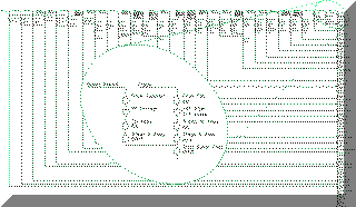
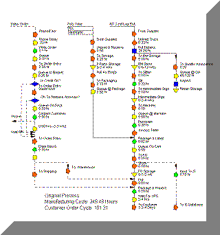
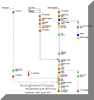
In this example, information processes in sales caused many order delays. These information sequences show as dashed lines on the left side of the map. The final product is a roll of automotive pin-striping tape. It starts as a large roll of vinyl sheet
While the manufacturing cycle was longer than the customer order cycle, a finished goods stock allowed immediate delivery once the order was processed. However this long manufacturing cycle created excess inventory and many stockouts.
Both the manufacturing and order cycle times went down by almost 80% with large savings in inventory, labor and increased customer service.
■ ■ ■ ■ ■ ■ ■

