
Inventory Analysis
Decoding The Language of Inventory
Operational Inventory Analysis
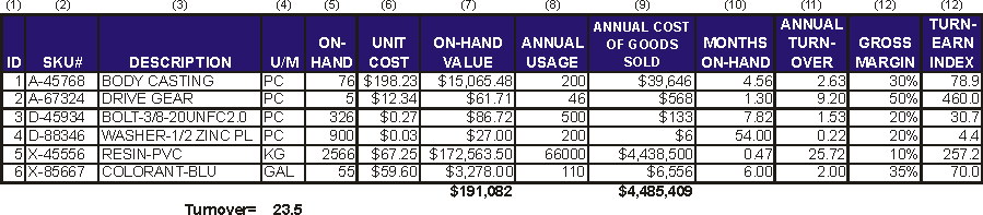
Table 2 Typical On-Hand Inventory Report
An operational inventory analysis uses the previously discussed metrics to identify areas of concern. It points the way to further investigations and possible solutions that improve operations and reduce unnecessary inventory.
There is no fixed format or detailed procedure for an inventory analysis. The format depends on the data available. The precise lines of inquiry depend on the situation as it reveals itself during the investigation. In many ways, it is like Sherlock Holmes investigating a murder. Accordingly, we illustrate the analysis with many examples from past projects rather than a detailed sequence of tasks and outputs.
Much of the data required comes from the inventory management system or an ERP/MRP system. This extraction process requires a person who is familiar with the system, the contents of various databases and the extraction process. In most cases, the data is best extracted to an Excel spreadsheet format. There may be several of these extraction files. Extraction files should include the basic fields such as part#, Description, U/M and On-Hand. There may also be additional fields that will prove useful. These additional fields might indicate a class of item, product line, storage location or other information. When in doubt about the usefulness of a possible extraction field, include it in the extraction file. It is easy to delete fields that prove irrelevant but often difficult to add them in later. Table 2 illustrates.
The overall turnover from this report, based on dollar value, is 23.5 and is quite favorable. However, this overall value is dominated by the large amount of PVC resin. Other items have much lower turnover as shown by column 11 and these might warrant some attention.
Product-Volume Analysis (PV)
A PV analysis examines the relative production or sales volume for various products and product groups. The purpose is to understand the product mix and volume. The analysis is helpful for many types of projects including: facilities planning, warehouse design, and process improvement. It often complements the inventory analysis and, since it uses some of the same data, we include it here.
Figure 3 shows the current product groups and volumes for a manufacturer of industrial heater modules. One set of bars denotes the dollar value of sales and is ranked by sales dollar volume. The second set of bars denotes units of production. Notice that the tubular heaters rank highest in sales dollars but lowest in production units. This is because they are very expensive and, presumably, have high margins. Figure 3 is actually not typical. Most firms have a have a much higher fraction of low-volume products coupled with only a few very high-volume products. This can raise important issues of pricing, overhead allocation and profitability.

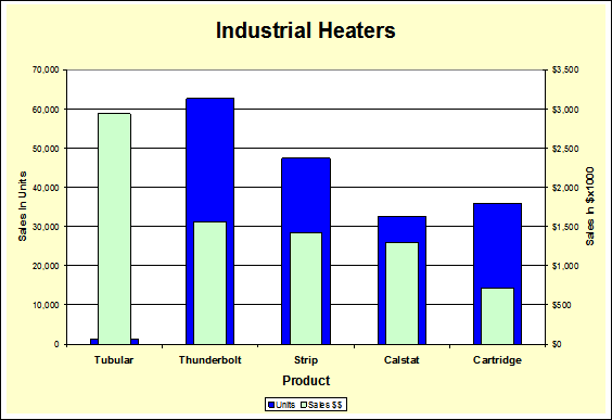
Figure 3 Products & Volumes
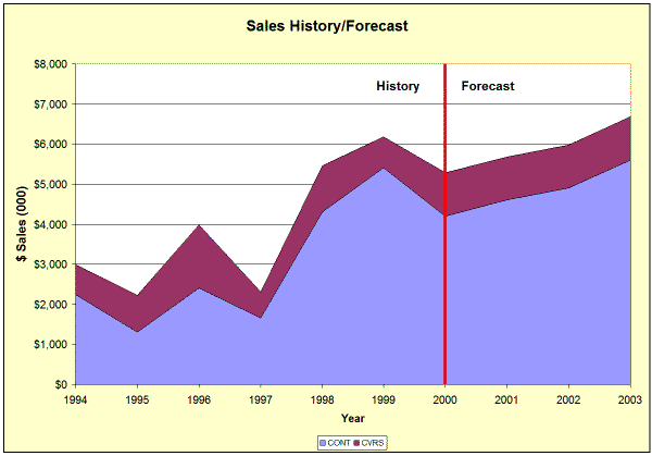
Figure 4 Sales History/Forecast
Figure 4 came from a plant layout project for a company with two major product lines. It shows the sales history for each product line and the total. Most of their growth is on the “container” product line and this has important implications for future facility planning, Manufacturing Strategy and business strategy.
A product-volume analysis answers questions such as:
- What is the current annual, monthly, weekly or daily volume for each item?
- What are the volumes for groups of similar items?
- Will there be significant changes in the relative volumes?
- How will total volume change in the future?
- Are there seasonal (or other) patterns in the volumes?
Industry Turnover Comparison
Turnover is one of the most important inventorymetrics. A firm may track turnover to determine trends, identify anomalies, make decisions and monitor progress.It can also benchmark against others in their industry.
Within an industry, the industry average turnover reflects “average,” almost a definition of mediocrity.There are often, however, a few firms that turn their inventory much faster than the average—perhaps 5-10times faster. This is shown in figure 6. Do not assumethat because a firm is near the industry average that it is “OK.” Average may be very poor performance compared to what is possible.
Figure 5 Turnover Data
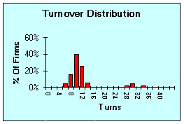
Figure 6 Typical Turnover Distribution
Since turnover is a common financial measurement, financial data sources such as Standard & Poor or Dun & Bradstreet provide such data for specific firms or as industry averages. One good source of turnover data is the U.S. Census Bureau’s American Factfinder site. Several cautions are in order when using such data:
- Two firms are rarely alike in all respects and turnover data may reflect these differences.
- Financial data may come only from public companies and these tend to be larger firms.
- A given industry may have wide turnover variations even from apparently similar firms.
- Turnover data is usually buried in a sea of other financial data and finding it is inconvenient.
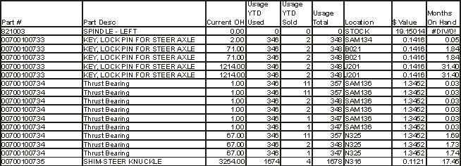
Table 3 Data Acquisition
Data Acquisition
Acquiring the data for the various parts of an inventory analysis is rarely difficult. Some data comes from previous year-end financial statements. Most of the charts that follow derive from a current dump of inventory status. Table 3 shows a small part of the Excel file used for many of the following charts. It is from a project with a distributor of replacement parts for off-road vehicles. We will call the company V-Parts for confidentiality reasons.
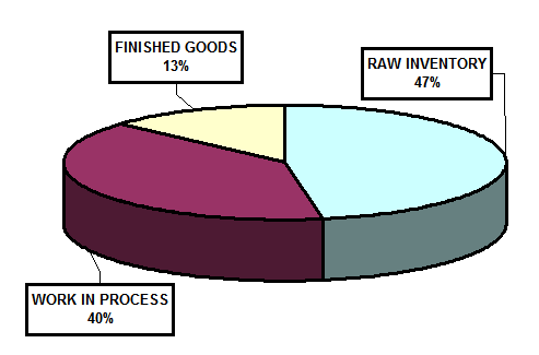
Figure 7 Specialty Valve Production Stage
Production Stage Analysis
Another helpful analysis is to determine the percentage of total inventory held at each production stage. Inventory is attracted to problems. Where there is inventory, there are problems.
In warehousing and distribution operations, a production stage analysis does not apply because there is only the one stage—Finished Goods. For manufacturing or for supply chain analyses a production stage analysis can point to significant problems and, eventually, to solutions.
The distribution of inventory between RM, WIP and FG is shown for the various categories in figure 5. In the absence of industry averages, common sense applies. For example, does it make sense for a manufacturer of Made-To-Order equipment to have significant Finished Goods inventories?
A manufacturer of large specialty valves for refineries, paper mills and other process plants had an inventory distribution as shown in figure 7. This did not, at first glance, seem out of order. However, the company produced only custom-built valves, made to order. There should be no FG inventory other than a few items waiting on the dock for shipment.
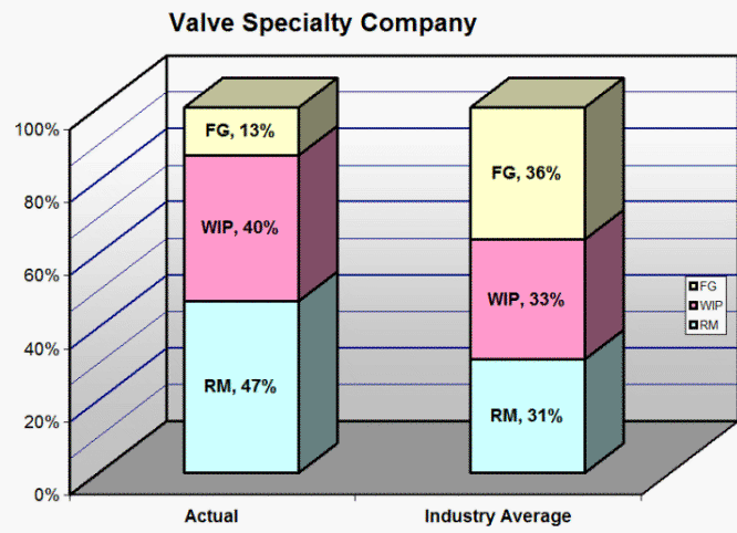
Figure 8 Industry distribution Example
Figure 8 compares the company’s inventory distribution to a general industry average. Other firms in the industry had about equal parts RM and WIP with a bit more FG. However, these other firms built many of their products for stock so the FG stock would be expected.
The relative proportions of WIP & RM were in line with industry averages but the FG stock did not make sense. Further investigation showed that most of this inventory consisted of items on an order that were waiting for completion of other items so the complete order would ship together.
This raised the question of why all items on an order were not scheduled for completion at the same time. The answer was parts shortages on Purchased items. Scheduling put products on the schedule that had parts available and others went on hold until parts came in, even if some were on the same order. This approach kept production busy but did not help the customers or the inventory situation.
What first appeared as an inventory problem, and then a scheduling problem, when followed to the root cause, was a supplier/purchasing problem.
Obsolete Part Numbers
A firm’s database is often clogged with obsolete part numbers. Such was the case with V-Parts. Figure 9 was generated by locating all parts with no On-Hand Stock and zero usage for the previous nine months.
It is possible that some of these part numbers are not truly obsolete but this quick analysis was a good estimate. The part numbers are candidates for deletion or archiving.
It is also possible that some part numbers are obsolete but there is still inventory on-hand. These are identified in the following analysis and are candidates for liquidation.
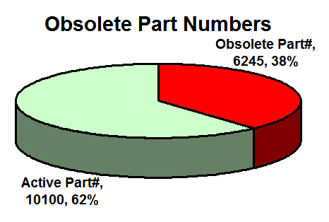
Figure 9 Obsolete Part Numbers at V-Parts
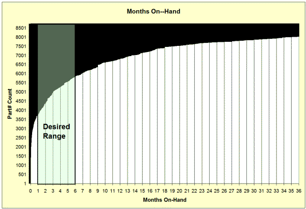
Fig 10 Months On Hand Inventory
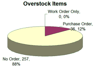
Figure 11 Replenishment of Overstock Items
Stockouts
Stockout rate is the percentage of items that cannot be supplied from existing stock. Many software packages can report on stockouts and help track the stockout rate. In the absence of such reporting, the stockout rate can be deduced from on-hand records and usage records.
The equipment distributor from figure 11 also had many items that were in stockout or eminent stockout. A rationalized replenishment system would have open purchase or work orders for such items. However, a comparison in figure 13 shows that 96% of their stockout items had no open orders. For V-Parts, we looked for parts with less than .08 months or about two days usage available. As figure 12 shows, about 20% of active parts are at or near stockout.
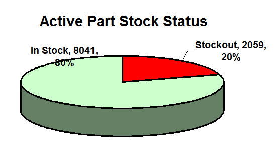
Fig 12 V-Parts Stock Status
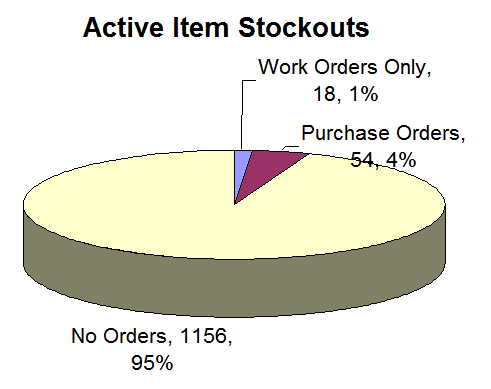
Fig 13 Stockouts With WO's Á POs
A common cause of excess inventory and low turnover is the presence of many items that sell slowly or not at all. These slow-moving, dead and obsolete items usually have much larger stocks than necessary. The TEI is one way to identify this slow moving inventory. Another method is to rank items by months-on-hand. That is the current on-hand quantity divided by monthly average usage.
Figure 10 charts the “Months On-Hand” for each item in the inventory. This is for a distributor of off-road vehicle repair parts. For most items, the desired quantity was 1-6 months usage. This translates to 2-12 inventory turns.
The figure shows that only about 25% of the 8600 active items were in the desired range. About 13% had more than a two-year supply. Another 20% or so were likely to result in stockouts.
Figure 11 is from a project with a distributor of industrial equipment replacement parts. This company had large overstocks on many different items.
With consistent and rational purchasing policies, overstock items should have no additional open work orders or purchase orders. It is often easy to check for open orders. In this case, we found that 12% of all overstocked items also had open purchase orders that would increase the overstock even further.
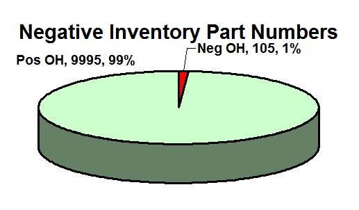
Figure 14 Negative Inventory
Inventory Record Accuracy
Inaccurate inventory records create many problems in scheduling, customer service and purchasing. It is a principle cause of low turnover. The Strategos website has a large section on Inventory Record Accuracy.
The data collected for the analyses shown here has some limited information that may lead to a deeper investigation of IRA. Negative On-Hand balances from table 3 are definitive inventory errors. Figure 14 shows that, of the active items at V-Parts, 1% have negative balances. Negative balances are only one of several types of errors and the easiest to identify and remove. With 1% of active items showing negative balance, the total error rate may be on the order of 10%-25%. For V-Parts, this line of inquiry should definitely be pursued.
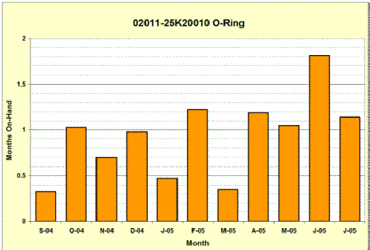
Figure 15 O-Ring OH History
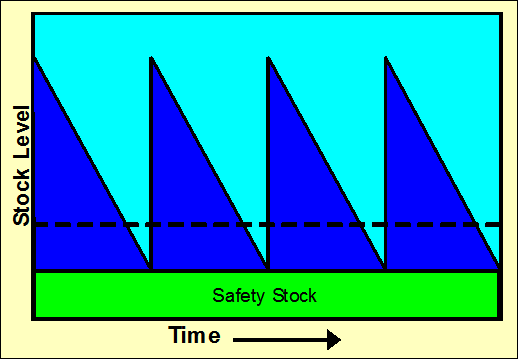
Figure 16 ReOrder Point Theory
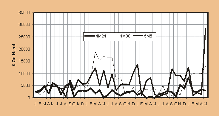
Figure 17 History Showing Chaotic Effects
Short Term Historical Analysis
In this analysis, Months-On-Hand are plotted on a monthly or weekly basis for 1-2 years. This is usually done for several representative individual items. The intent is to discover any hidden patterns in the inventory situation. Such patterns might be from seasonal demand or unusual buying patterns.
For the O-ring of figure 15, the pattern appears normal. OH balances range from about two weeks to one month. There may be a general trend towards increasing on-hand balances and this should be watched or investigated.
Figure 16 shows how a simple ReOrder Point (ROP) system is supposed to work. The On-Hand level starts at a particular level, say 100 units. Over time, withdrawals are made to satisfy demand and the OH level decreases. When the OH level reaches a pre-determined level, shown by the dashed line, a purchase order or work order is created. It requires time to fill the order and during that time, the OH level continues to drop. When the order arrives, the OH level returns to the maximum point and the cycle repeats. An additional “Safety Stock” is supposed to compensate for variations in demand or replenishment.
There are many discrepancies between theory and practice with ROP. Few of these systems operate with the clockwork regularity shown in figure 16. A short-term historical analysis can determine whether ROP (or some other system) is operating within reasonable limits.
For example, figure 17 shows the On-Hand level of four distinct products for a manufacturer of sheet metal duct fittings. In this project, the control system used a simple ROP approach. Demand was reasonably steady although there was some known seasonality.
A brief glance at figure 17 makes it clear that there is not particular pattern over the three plus years of this study. Moreover, the four parts have patterns that only roughly coincide with each other. This is an example of the chaos that can be generated entirely within the system, even when demand is perfectly constant. There is more on this topic at the Strategos web page “Stabilizing Production Scheduling”.
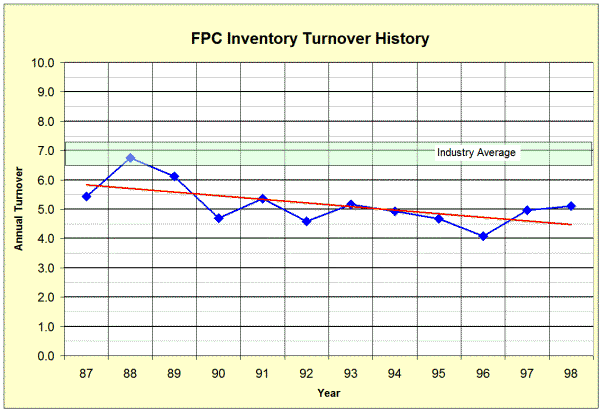
18 Typical Long-Term Historical Analysis
Long-Term Historical Analysis
There may be long-term inventory trends and this analysis can show them. Construct a graph with overall inventory turns for the previous 5 years or more. This information can come from the year-end financials.
Figure 18 is typical of the first stage of historical analysis. Depending on the results, more detail may clarify the historical situation. Figure 3 shows a definite downward trend in turnover. The year-to-year changes have probably not attracted management’s attention because they are relatively small and there are always good reasons for increased inventory. However, in the longer-term context, this trend should be addressed.
Summary
simple inventory information as shown in tables 2 and 3 plus a transaction history can reveal many things about inventory and the processes behind that inventory. In this article we have illustrated how to interpret inventory data and point the way to process improvement, customer satisfaction and profitability.
Purchase Industry Average Data
One good source of turnover data is the U.S. Census Bureau’s American Factfinder site. The data includes firms of all sizes and is arranged by NAIC code (formerly SIC code). However, calculating turnover from this extremely detailed data is not easy. Strategos has extracted the relevant parts from the Census Bureau data and put it in a convenient form for inventory analysis. A section of this spreadsheet is in figure 5. You may purchase a copy of the manufacturing or warehouse data by clicking at right ($8.00):

■ ■ ■ ■ ■ ■ ■

|
The Strategos Guide To Value Stream and Process Mapping goes beyond symbols and arrows. In over 163 pages it tells the reader how to do it and what to do with it. |
The free newsletter of Lean strategy